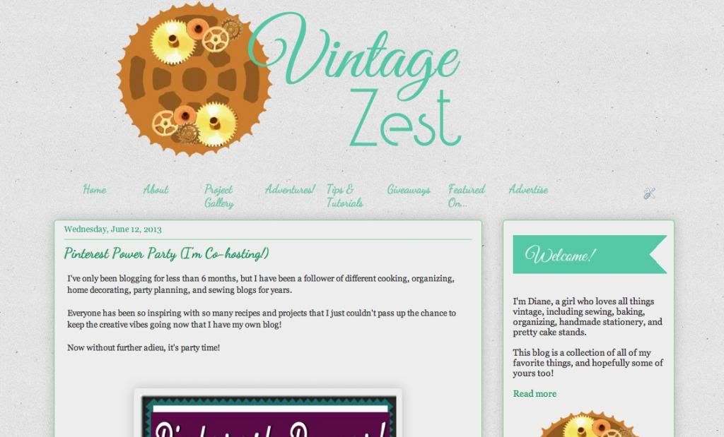
Here is a reminder of my old home page from my last blog redesign in June of last year. Not a particularly interesting and not much of a statement because it just dove right into the most recent posts. Also, the sidebar started off good with a welcome, but just ended up as a long string of widgets without much organization. Lastly, the top menu was just okay, but I like lots of pages and eight wasn't cutting it. All of that has changed now!
P.S. - If you notice that anything is amiss, please let me know so I can fix it right up! Coincidentally, there are 10 major changes, so this isn't a Top 10 list on purpose, just a nice little coincidence!
Welcome to the new design!
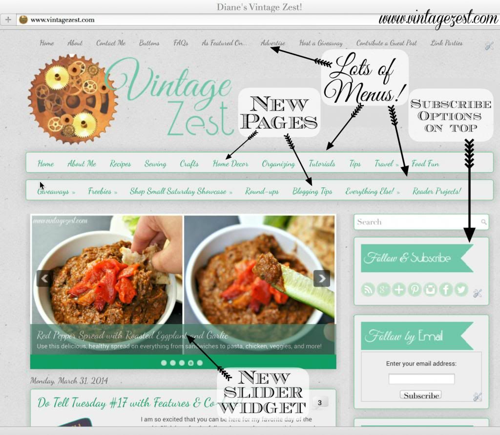
1. New Pages
- Now that I started woodworking and putting together round-up posts from Do Tell Tuesday, plus the anticipation of the new house and my sister's wedding, I want more pages for all of the new posts!
- By the way, a bunch of the pages are still under construction, but I'm working on indexing my posts soon!
- Here is a quickie list:
- Home Decor
- Woodworking
- Freebies
- Printables
- Adventures: Fun times around SoCal that don't quite count as travel, but exciting nonetheless!
- Round-ups
- Blogging Tips
- Reader Projects: photos and links to readers who have done one of my tutorials!
- Giveaway winners: pictures of winners of any of my giveaways with their prizes!
- Everything Else: Other posts that I've indexed as Thoughts, Stumped on Sunday, or Miscellaneous
2. Lots of Menus!
- Since I have more new pages, I need many more menus of course. :) Also, they look like widgets so they stand out from the background a bit more.
- The important, reference type info is at the top.
- Projects and more are on the bottom two menus, but with even more goodies.
3. New Slider Widget
- Possibly my favorite addition to the homepage. I love it! I get to pick five rotating posts at the top, so it will be fun to see how often I update it. ;)
4. 10 Posts on Home Page
- You can't actually tell, but instead of having 5 super-long post recaps on the front page, I have 10 quick peeks with the top picture and a few lines for much easier browsing
5. Subscribe Options on Top
- Lately, I have had about one person a week ask to subscribe to my mailing list, so I realized that my subscription options were a bit hidden in the sidebar. Now, they're front and center! Or rather front and to the aligned to the right. :)
Now, let's check out more of the sidebar!
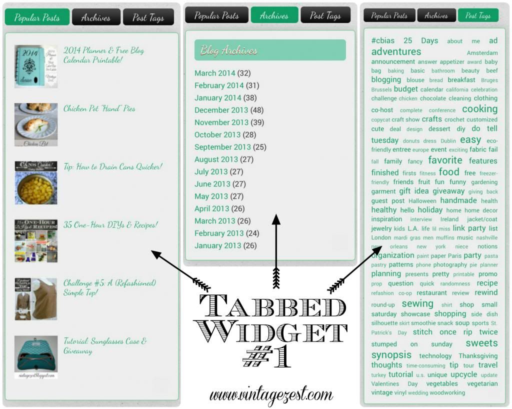
- I love this tabbed widget because it hides a few options that some people want to see occasionally but might otherwise be clutter.
- In this one, I put Popular Posts, archives, and Post Tags. See how they're different lengths? Well, it doesn't matter because it's a smart widget that automatically moves everything below it. :)
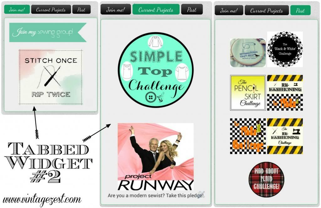
7 & 8. Tabbed Widgets #2 & 3
- Widget #2 has to do with Stitch Once, Rip Twice. Oops! Looks like I have to update the Simple Top Challenge to our past challenges. :)
- Widget #3 is for sponsors, affiliates, and my blog roll.
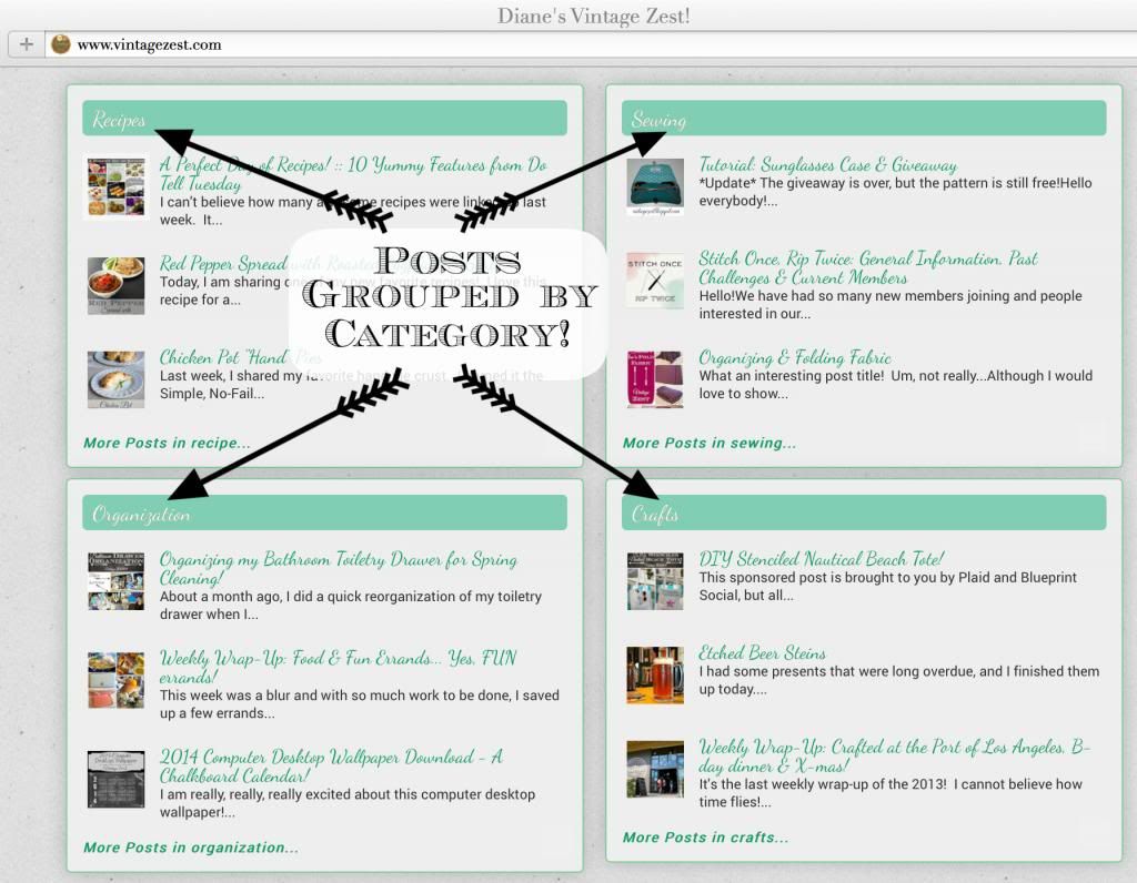
9. Widgets with posts grouped by Category!
- I think this is a fun feature to have my posts grouped by category. I can easily change it around too, but for now I think these are the categories that I will leave up. :)
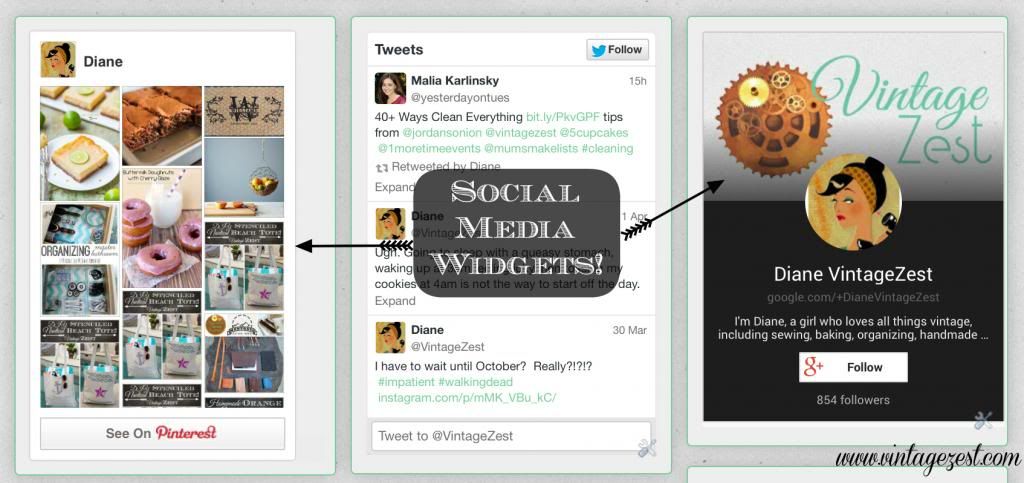
10. Social Media Widgets
- At the footer, I a few interactive social media widgets so people can follow me at the touch of a button! It includes Pinterest, Twitter, and Google Plus, plus Instagram is on the sidebar near the bottom.
And that's it! I like that it is more organized, and hopefully newbies will think that Vintage Zest was this awesome the whole time I was blogging. :)
What do you think? Any changes that you like or dislike? Any other suggestions for me?




I like it! I was up all night redesigning my blog.
ReplyDeleteVery user friendly, love the nip/tuck you have done with it. We all need a refresher as we welcome spring and await summer.
ReplyDeleteThanks so much! Looks like great minds think alike. ;)
ReplyDelete